
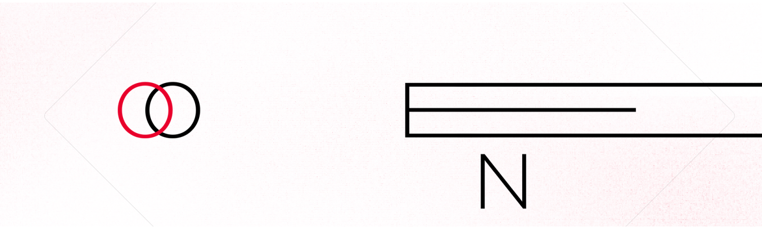
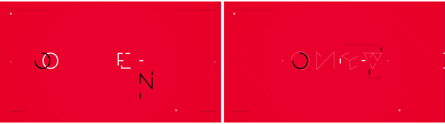
As part of a full rebrand of the OMEN by HP products, Giant Spoon approached us to create the official OMEN animated logo that would exist across multiple facets of the brand. This was right off the heels of our branding for GGWP, so we were familiar with the brand and the direction they wanted to take it.
There was no shortage of inspiration once we received the brand guidelines that Giant Spoon had created. Included in the new language was a set of iconography, unique shapes that are representational of the company. We chose four icons that complimented the OMEN logo type, and based our animation around the progression of the shapes building on and transforming into the letterforms.
Development
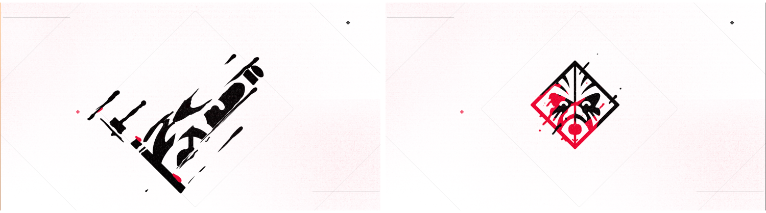
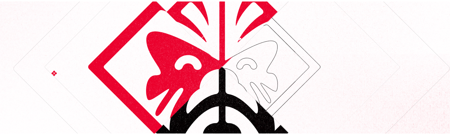
KIRIN MARK
Alongside the primary logo, we were asked to produce multiple animations for the ‘Kirin’ mark, the brand mark that speaks to the company’s Voodoo PC heritage. These animations could be tagged onto the hero logo as an endtag or provide a hit of branding at the beginning of content.
Development

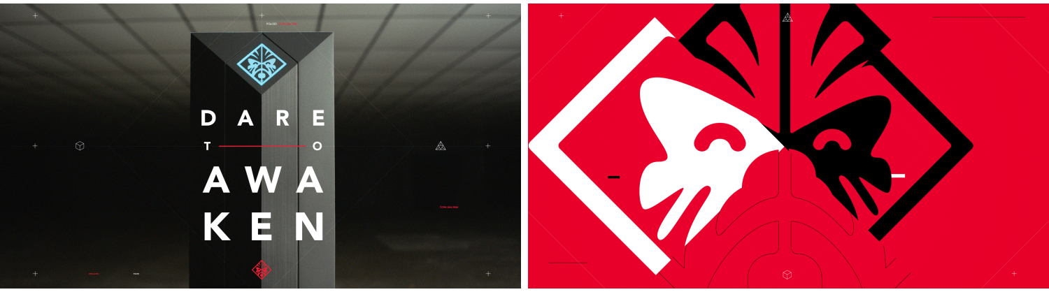
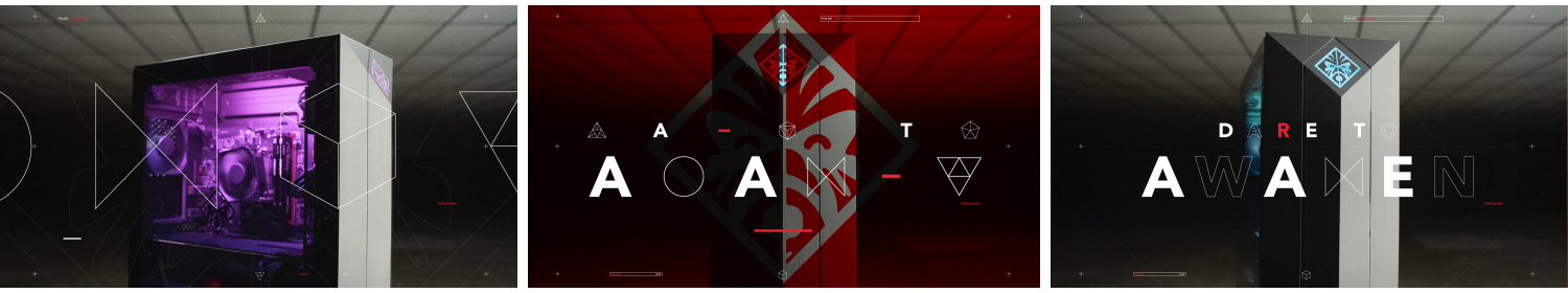
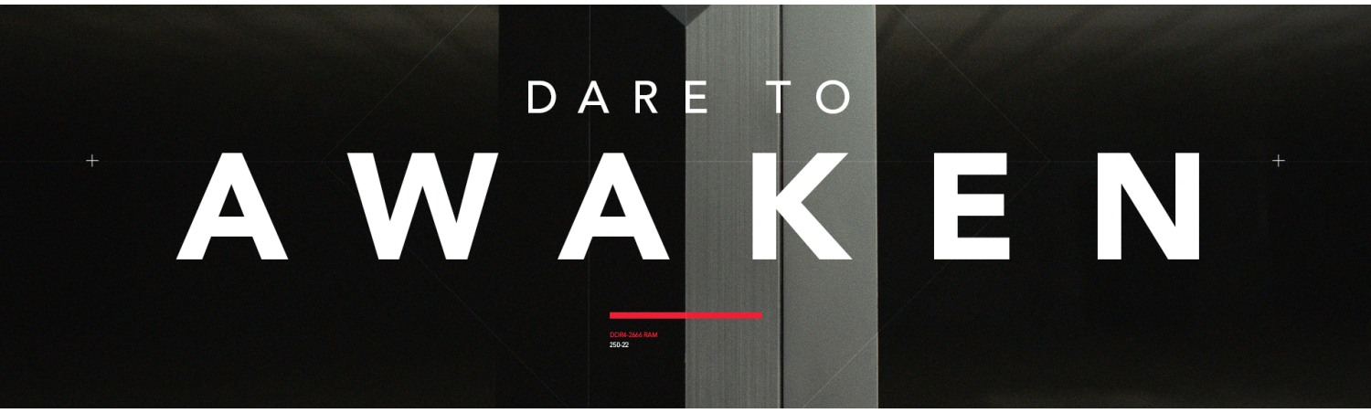
Awaken
We put these logo devices into use when we created the lockup and logo resolve for the ‘Dare to Awaken’ campaign which promotes OMEN by HP’s Overwatch League sponsorship. The concept behind the piece was that players become something different when a game starts, awakening their true selves. On top of the animation language established with the logos, we leaned into this ‘awakening’ idea to drive our animation, everything starting compact and opening up as it progresses.
Development
Client
OMEN by HP
Agency
Giant Spoon
Creative | Design | Direction
Ranger & Fox
Design & Animation
Oscar Mar
Sound Design
Therapy Studios, Dave Groseclose
Music
Teenage Diplomat